Operations Planning Tool
UX/UI DESIGNDesigned UI improvements for a geospatial operations planning platform that enables users to visualize environments, define operational areas, and manage planning workflows through an interactive 2D/3D map interface. I focused on improving usability across complex workflows by redesigning the shape drawing experience, enhancing map interactions, and reorganizing key interface panels to create a clearer information hierarchy. The work included simplifying how users create, edit, and manage spatial data, improving discoverability through contextual guidance, and creating a more intuitive experience for planning and operational decision-making.
TOOLSFigma, Design Systems
TIMELINEApril 2026 - July 2026
COMPANYLyntris
The Challenge
The existing platform presented usability challenges due to complex navigation, inconsistent UI patterns, and a lack of alignment with the overall design system. Users had difficulty understanding workflows and locating key controls, creating friction during critical planning tasks. The goal was to establish a more consistent and scalable interface by modernizing UI elements, improving information hierarchy, and creating a cohesive experience that aligned with the design system while supporting complex operational workflows.
WIREFRAMING
Layers panel redesign: early wireframe exploration
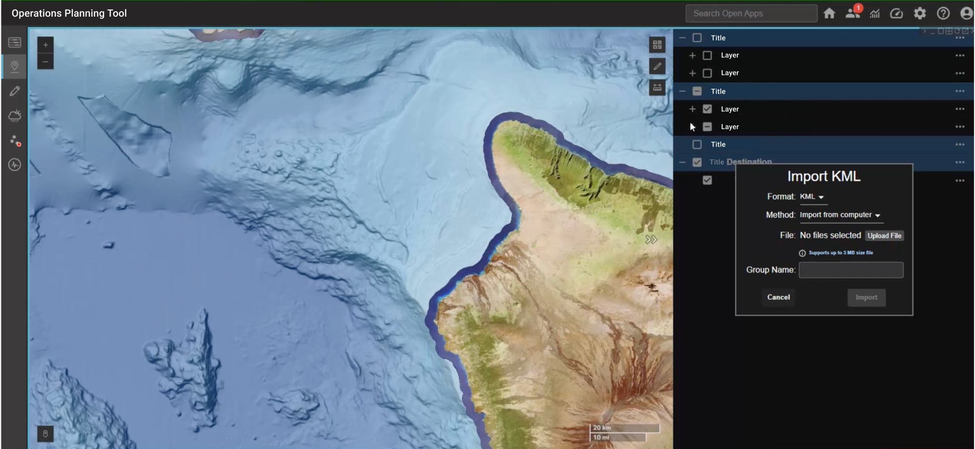
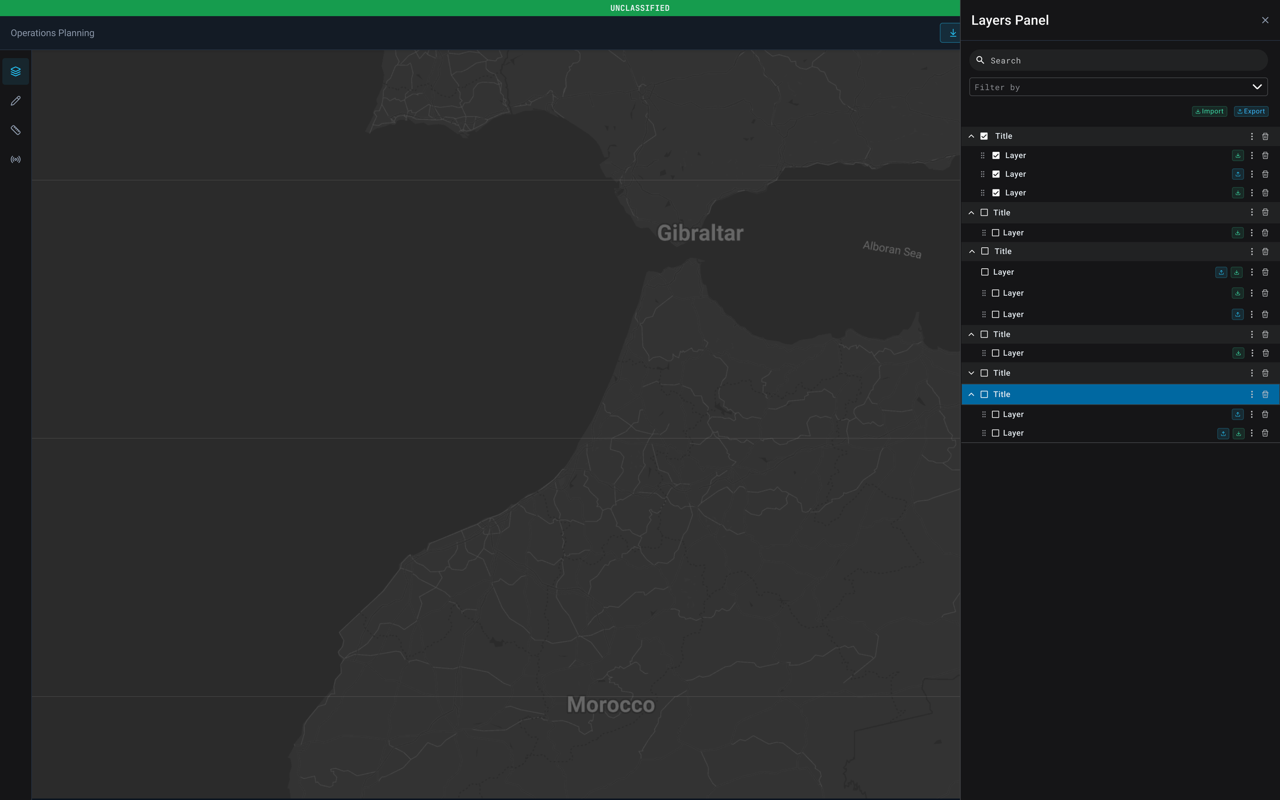
The existing layers panel in our operations planning tool had grown organically, generic "Title" and "Layer" labels, flat checkbox rows, and no clear way to tell layer types apart at a glance. As the number of layers has grown, that structure stopped scaling. This round of wireframes explores a few different directions for restructuring it before committing to a direction.
The problem
No visual distinction between layer types (terrain, tracks, hazards, imagery)
Categories exist in name only, "Title" rows carry no real information
No indication of live/streaming data vs static layers
Flat list doesn't scale as layer count grows
GROUPED TREE
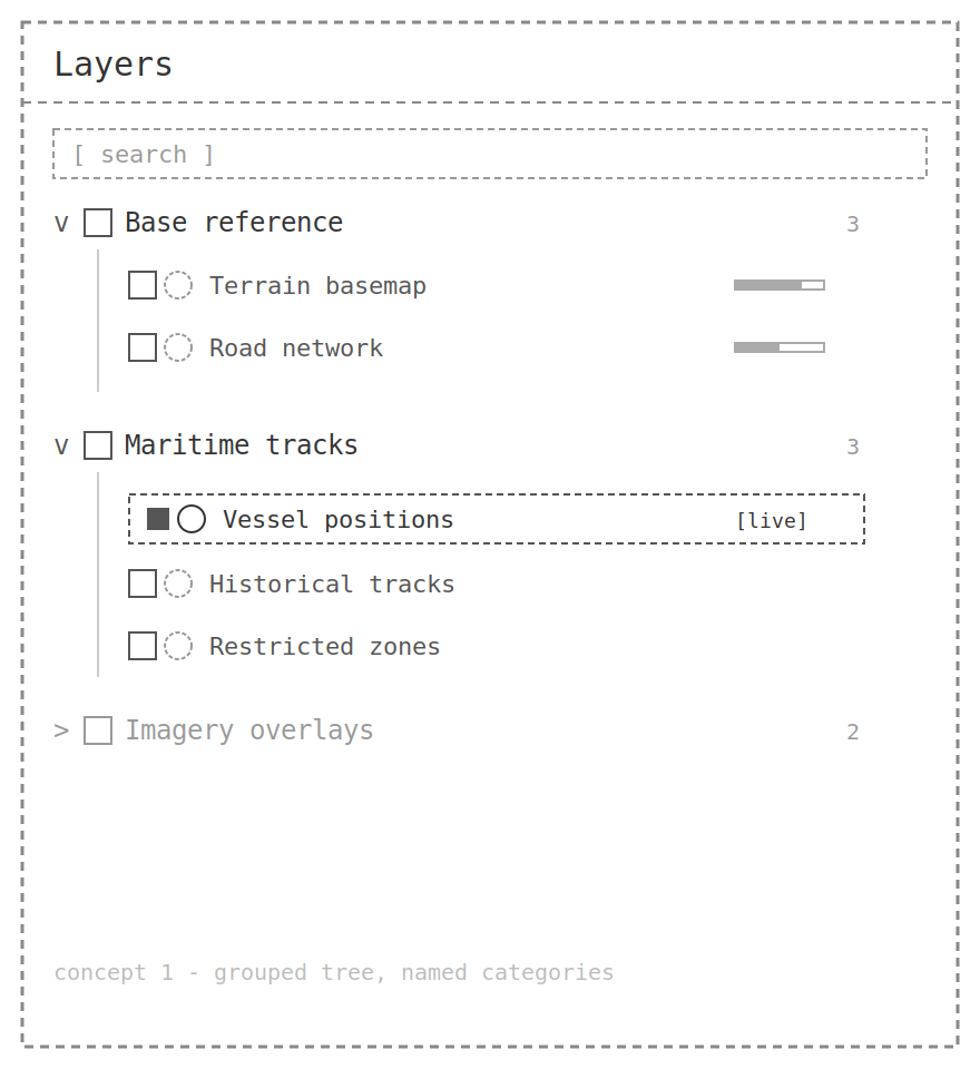
This concept named categories Keeps the familiar collapsible tree structure, but replaces placeholder labels with real category names ("Base reference," "Maritime tracks") and adds per-layer icons, opacity indicators, and status badges for live data. Lowest-risk change — closest to the current mental model.

FLAT LIST
Drops nested grouping entirely. Every layer sits in one searchable list, and categorization happens through filter chips instead of folders. Better suited to layers that don't fit a strict hierarchy, or a workflow that's search-first rather than browse-first.This concept named categories Keeps the familiar collapsible tree structure, but replaces placeholder labels with real category names ("Base reference," "Maritime tracks") and adds per-layer icons, opacity indicators, and status badges for live data. Lowest-risk change — closest to the current mental model.
SPLIT PANE
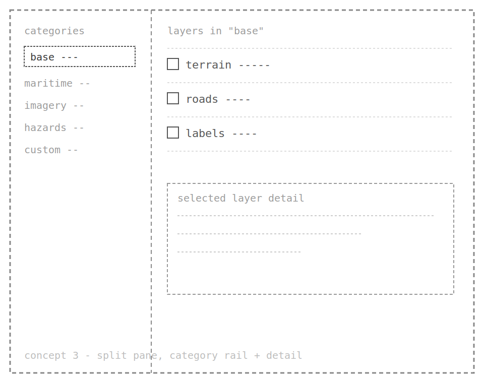
A slim category rail on the left, layers for the selected category on the right, with room for a detail/settings panel below. Keeps any single view short and gives space for per-layer settings that don't fit in a row.
icon cards
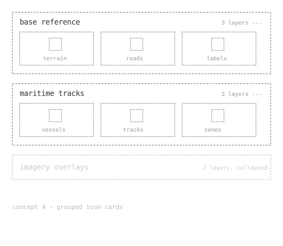
Categories as cards, with layers shown as icon tiles in a row rather than a vertical list. Optimized for scanning by icon and toggling whole categories at once, at the cost of being less compact for long lists.
USER PERSONAS
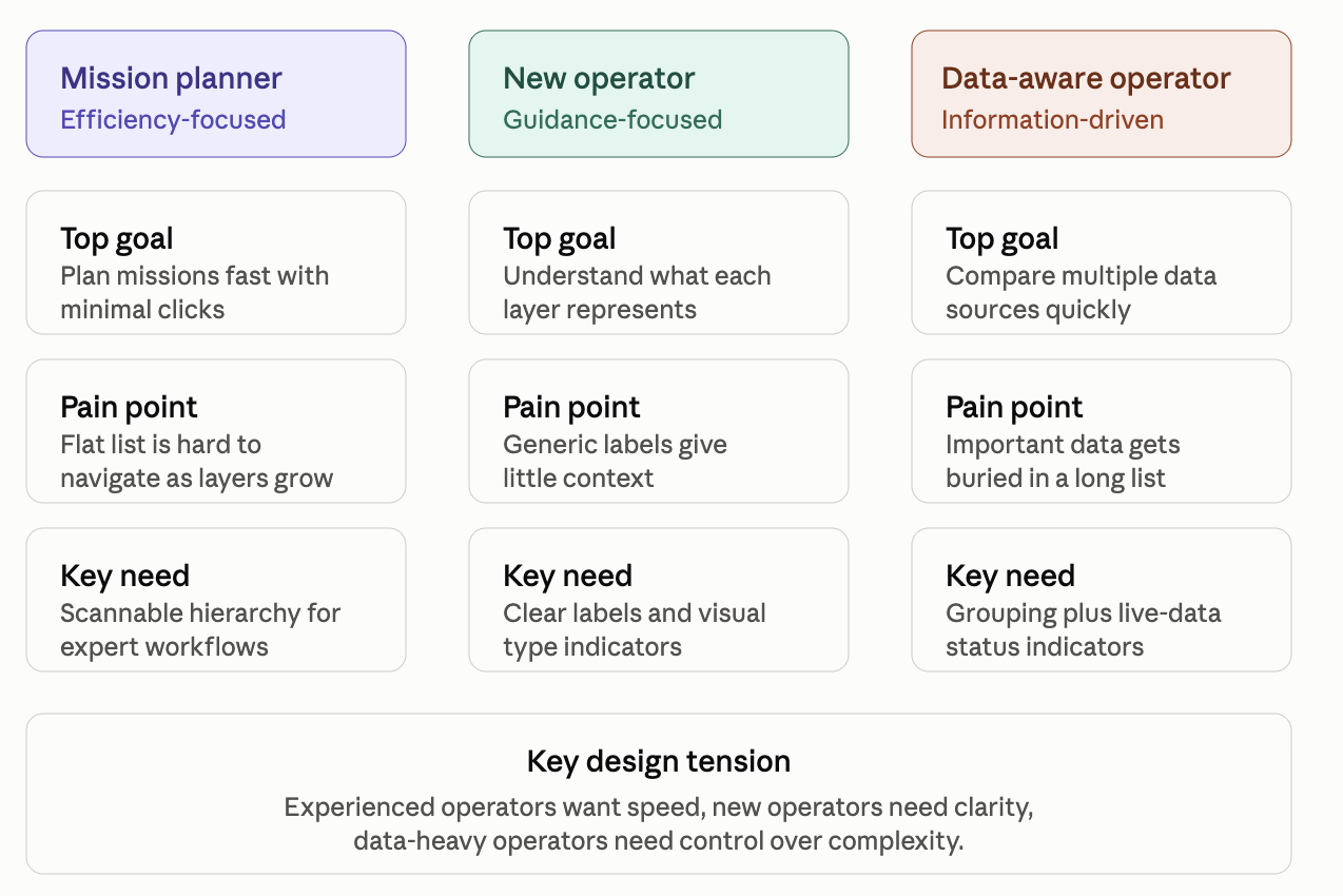
I identified three key operator personas with different needs when managing layers: the experienced mission planner, who prioritizes speed and efficiency; the new operator, who needs clear labels and guidance to understand the data; and the data-focused operator, who needs to quickly organize and interpret multiple data sources. These personas helped shape a more scalable layers experience that balances efficiency with clarity and makes complex operational data easier to navigate.
ui re-DESIGN
The UI redesign focused on creating a more cohesive, intuitive, and scalable experience by aligning the platform with an established design system and introducing consistent patterns across the interface. We decided on the grouped tree strurcturing. I redesigned key UI components, improved panel layouts and organization, refined navigation and controls, and enhanced visual hierarchy to make complex workflows easier to understand and execute.
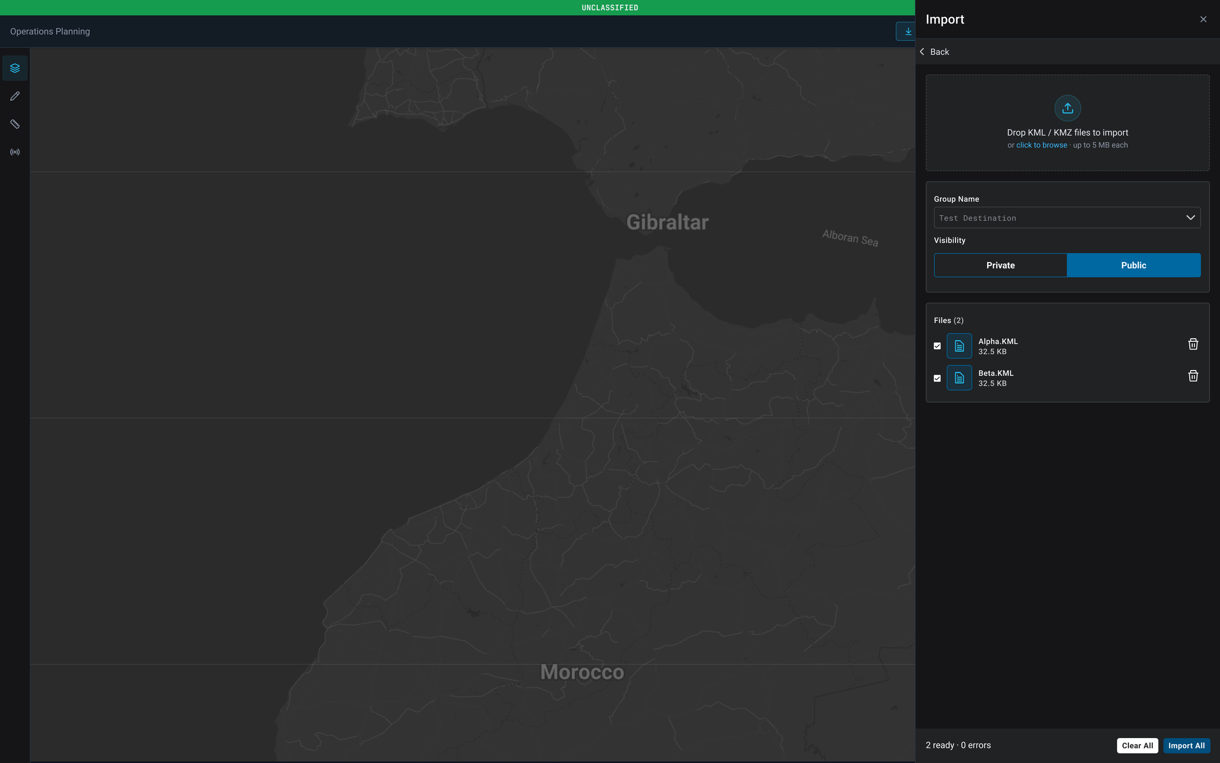
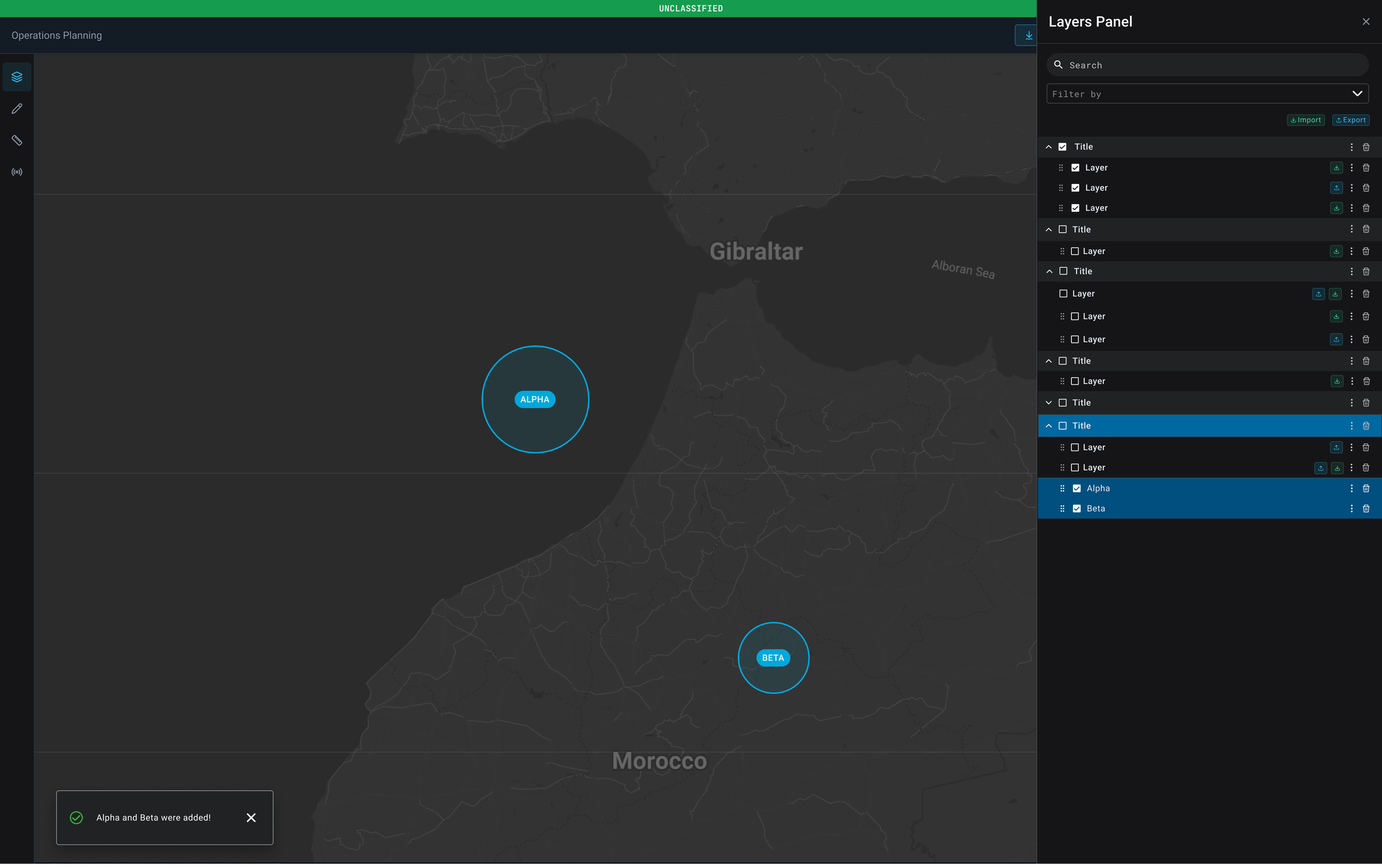
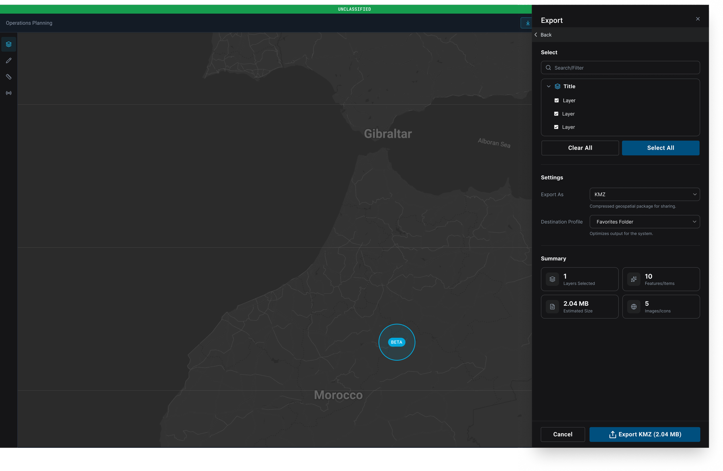
As part of these improvements, I added KML import and export capabilities within the Layers panel, allowing users to seamlessly manage external geospatial data, share information across workflows, and improve the overall flexibility of operational planning. The updated design created a more streamlined experience while providing a stronger foundation for future platform enhancements.
SHAPE DRAWING TOOL
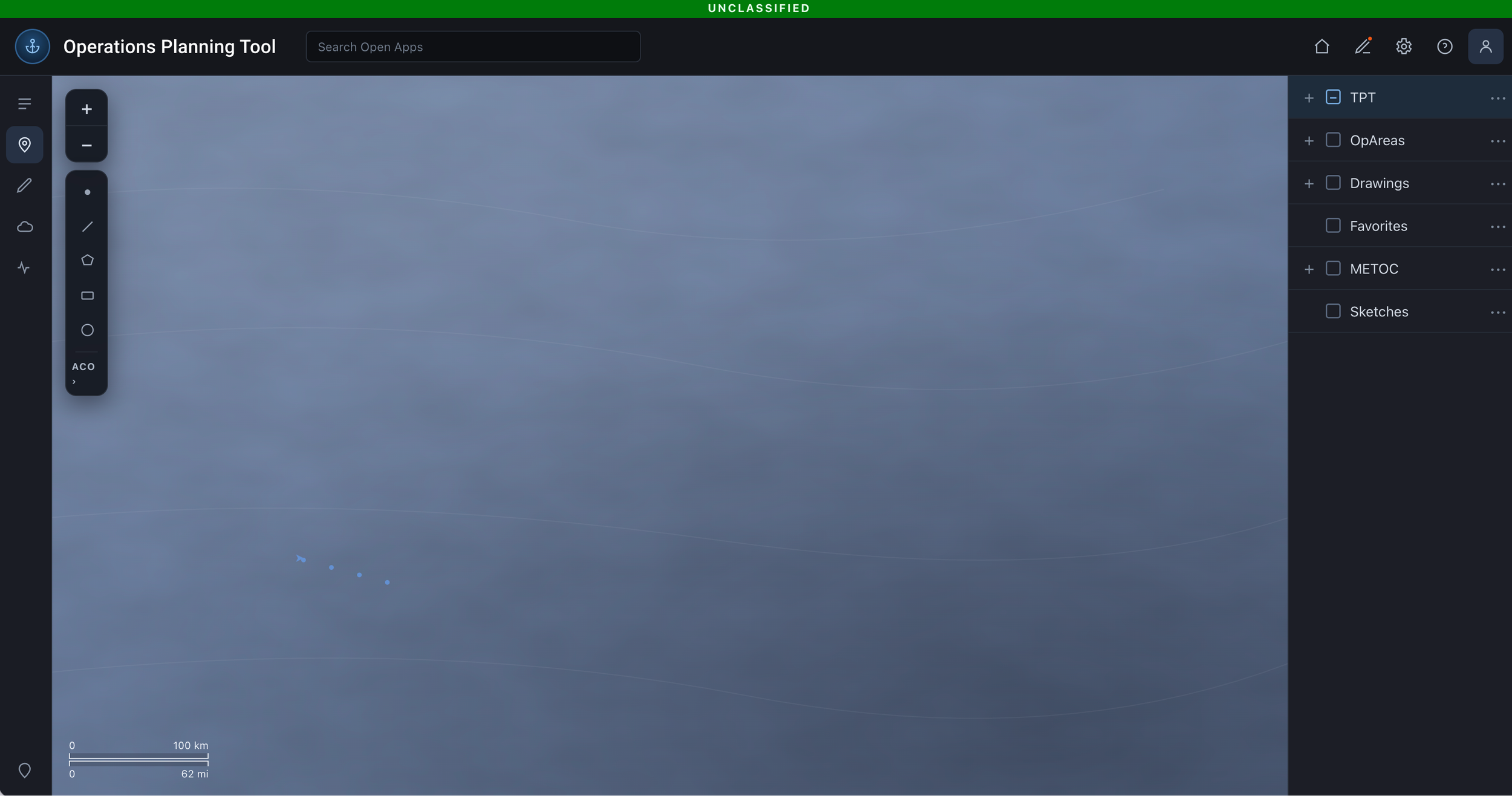
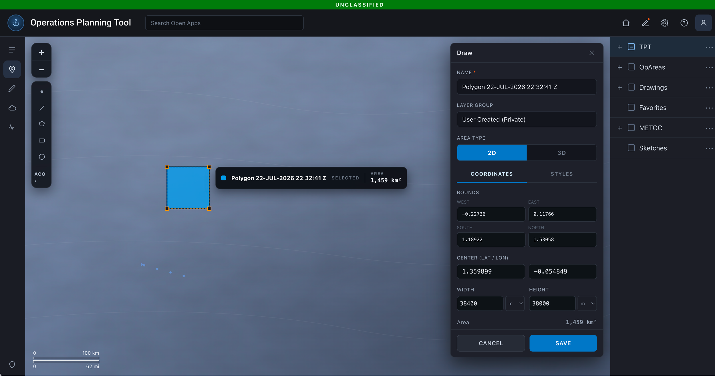
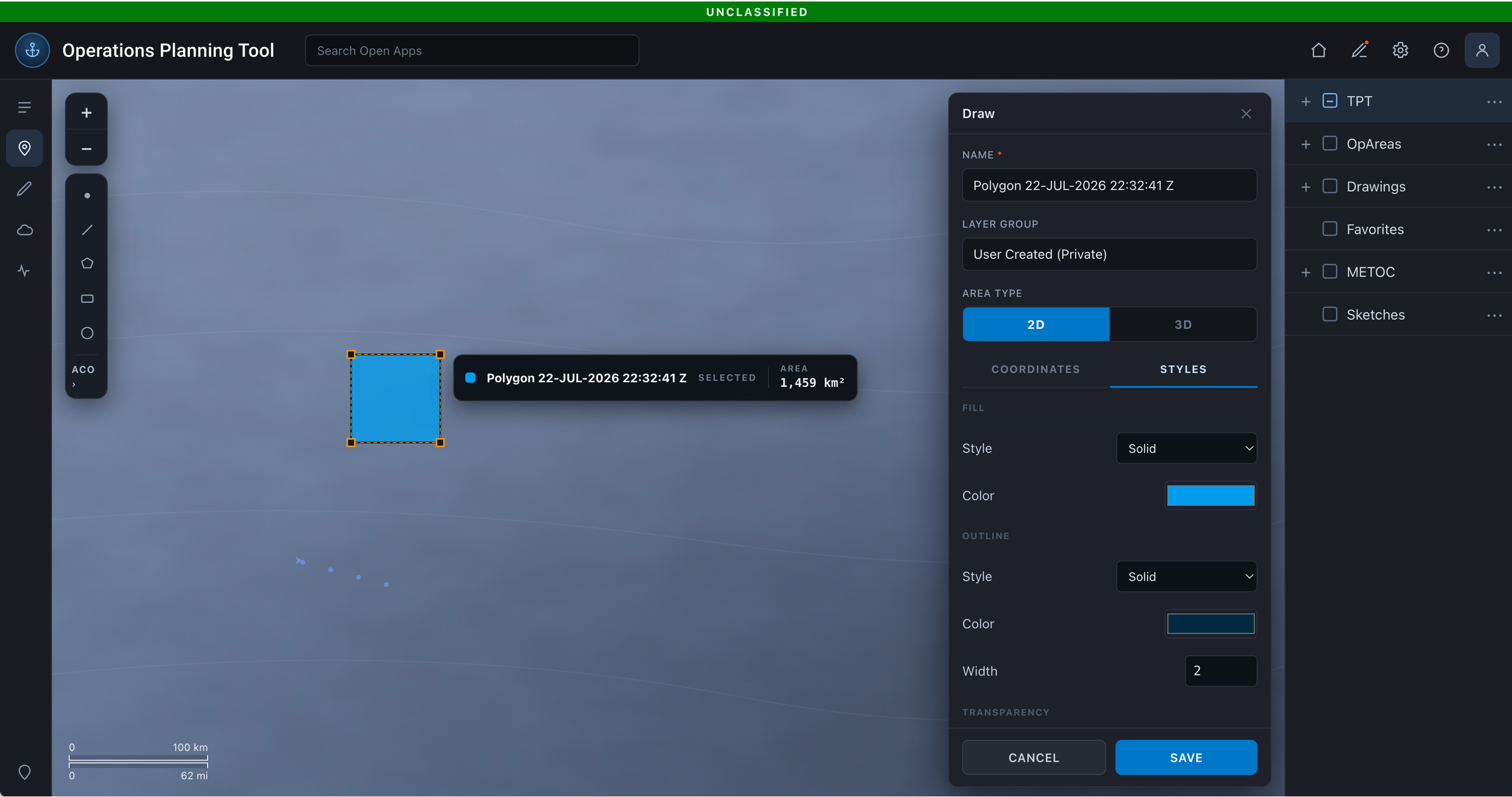
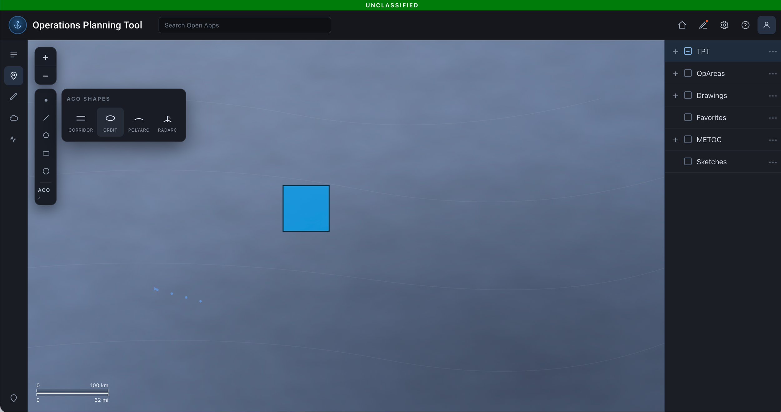
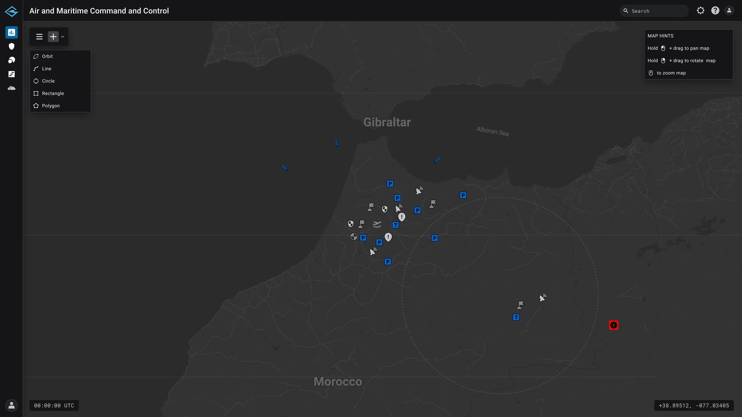
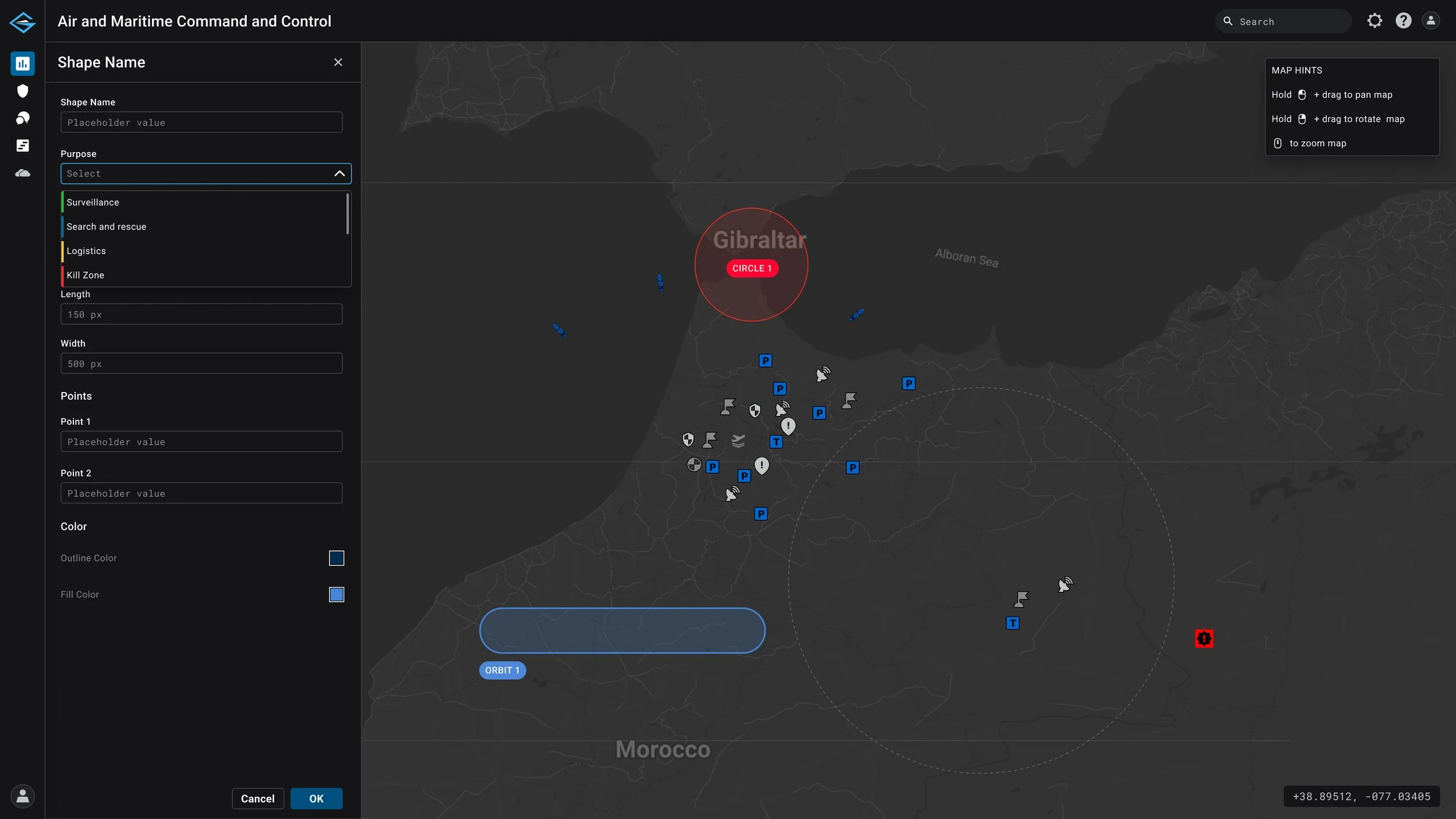
The shape drawing tool was redesigned to provide users with a more intuitive way to create, edit, and manage operational areas directly within the map environment. The initial UI design leveraged patterns and components I created for the Air and Maritime Command and Control platform, ensuring consistency with the broader design system.
implementation for operations planning tool
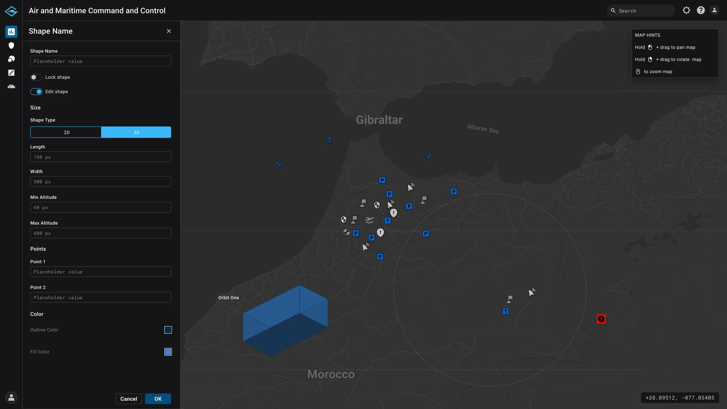
The experience was later refined and restyled to better align with the Operations Planning Tool’s unique look and feel while maintaining a consistent and scalable interaction model. The updated workflow improved shape creation, editing controls, visual feedback, and 2D/3D spatial understanding, making it easier for users to define and manage operational areas within the map.